

For years, 50 shades of white, beige and grey have dominated home décor, but there’s something to be said for bringing a little more colour into our lives. Whether it’s a dramatic accent wall, colourful kitchen cabinetry or a front door that makes a statement, homeowners are becoming more adventurous with their decorating choices. And if Benjamin Moore’s Color of the Year 2027 is any indication, green is going to be getting plenty of attention.
Meet Webster Green HC-130, a rich, sophisticated shade that feels familiar without being predictable. It’s the centrepiece of Benjamin Moore’s Color Trends 2027 palette, which features eight colours ranging from soft, understated neutrals to deeper, more dramatic hues. The collection offers plenty of inspiration for anyone looking to refresh their home, whether that means a complete room makeover or simply introducing a new colour into an existing space.
But how does a paint colour earn the title of Color of the Year and what makes Webster Green the right choice for 2027? DIVINE spoke with Hannah Yeo, Senior Manager, Color Marketing at Benjamin Moore, about the inspiration behind this year’s selections, what’s influencing the colors we’re choosing for our homes and how to incorporate Webster Green into your own décor.
Can you take us behind the scenes of how Benjamin Moore selects its Color of the Year? What goes into the process, and how far in advance does it begin?
The Benjamin Moore Color Trends is developed entirely in-house by our Color Marketing team. The process unfolds over the course of a year, with the team continuously gathering inspiration from design and trade events, cultural shifts, trend discussions and observations from everyday life. Then the team come together to share what we’re seeing and identify common threads. One of the strengths of our team is that we each bring unique perspectives on color, leading to rich discussions around why certain hues resonate, how design preferences are evolving and how the way we live influences the colors we choose to surround ourselves with.
These insights are then distilled through the lens of paint, ensuring the colors we select not only reflect the cultural moment but also translate beautifully into enduring wall colors. This year, our conversations centered on the idea of thoughtful design and the role that trend plays in our home. We noted how colors and items that we bring into our spaces earn their place, rather than serving as a fleeting expression of trend. We also recognize the growing desire for colors that offer lasting relevance. Ultimately, we were searching for colors that balance freshness and excitement with reassurance and enduring appeal.
What made Webster Green stand out as the Colour of the Year for 2027? What does this particular shade say about where interior design is heading?
As the team discussed searching for colors that balance freshness and reassurance, we naturally gravitated toward the green family. Green possesses an inherent sense of composure, blending the calm dependability of blue with the optimism of energy of yellow. It is a color that feels both grounded and uplifting.
As we dug deeper, we found that green has remained remarkably relevant throughout decades of design. Looking through our archives, we saw how the color family has adapted to changing aesthetics while maintaining its enduring appeal. We wanted to select a green that has composure and timelessness, while feeling right for today’s spaces. This led us to Webster Green HC-130. Confident and classic, it has sophisticated composure that enlivens and adapts across design styles. This color nods to timeless palettes that have shaped interior design, yet supports the current desire for trusted, grounded hues that create distinctive and noteworthy spaces.
We’re seeing a resurgence of richer, more expressive colors in home décor. What’s driving this shift away from the neutral palettes that have dominated interiors for so long?
While neutrals remain an important part of interior design, we’re seeing growing interest in colors that bring depth, character and a sense of permanence to a space. Homeowners are taking a more thoughtful approach to their interiors, collecting and curating furnishings, objects and colors that earn their place in the home. As a result, homes are becoming more personal and layered – reflecting the places people have been, the things they value and the stories they want their spaces to tell. Color plays a significant role in that expression. Richer, more nuanced hues bring individuality to a space while also offering the stability, composure and timeless quality many people are seeking today.
The Color Trends 2027 palette features eight shades, from soft neutrals to deeper, more dramatic hues. How was the palette developed, and how do the colours work together?
The Benjamin Moore Color Trends 2027 palette was shaped through extensive research across design disciplines, from interior design and architecture to fashion and product design. Throughout our exploration, themes of adaptability, personalization, comfort and wellbeing consistently emerged as priorities.
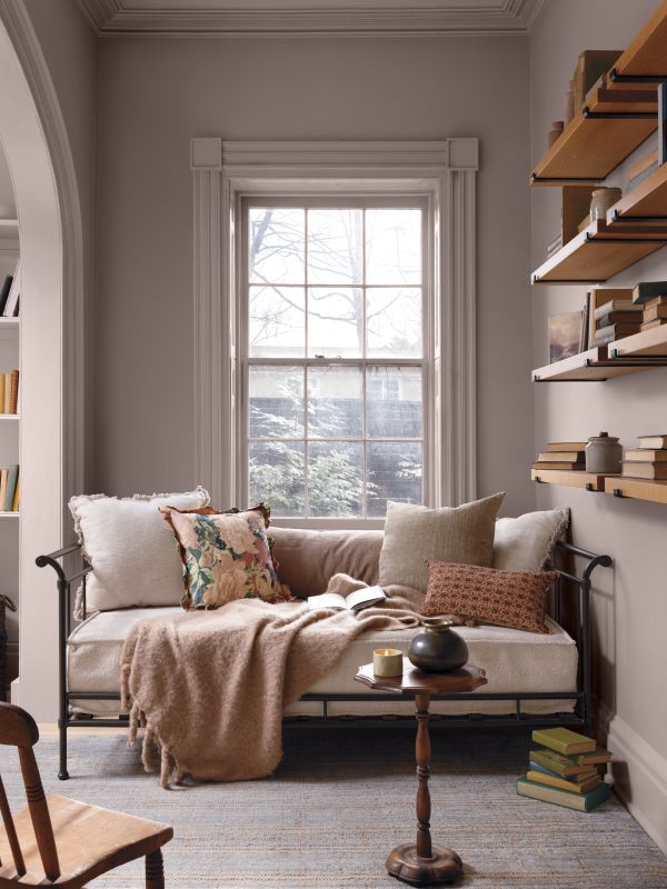
The eight colors reflect these ideas, balancing hues that feel current and inspiring shades that evoke familiarity and lasting appeal. Together, the palette echoes the past while embracing the present, creating a palette of colors that feel warm, inviting and enduring. While each color can stand beautifully on its own, they can also be worked together both for interior and exterior of the home. Whether used in layered combination or as individual statements, the palette provides homeowners and designers with inspiration and confidence throughout the color selection process.
Where do you see Webster Green working particularly well in the home? Are there certain rooms or applications where it can make the biggest impact?
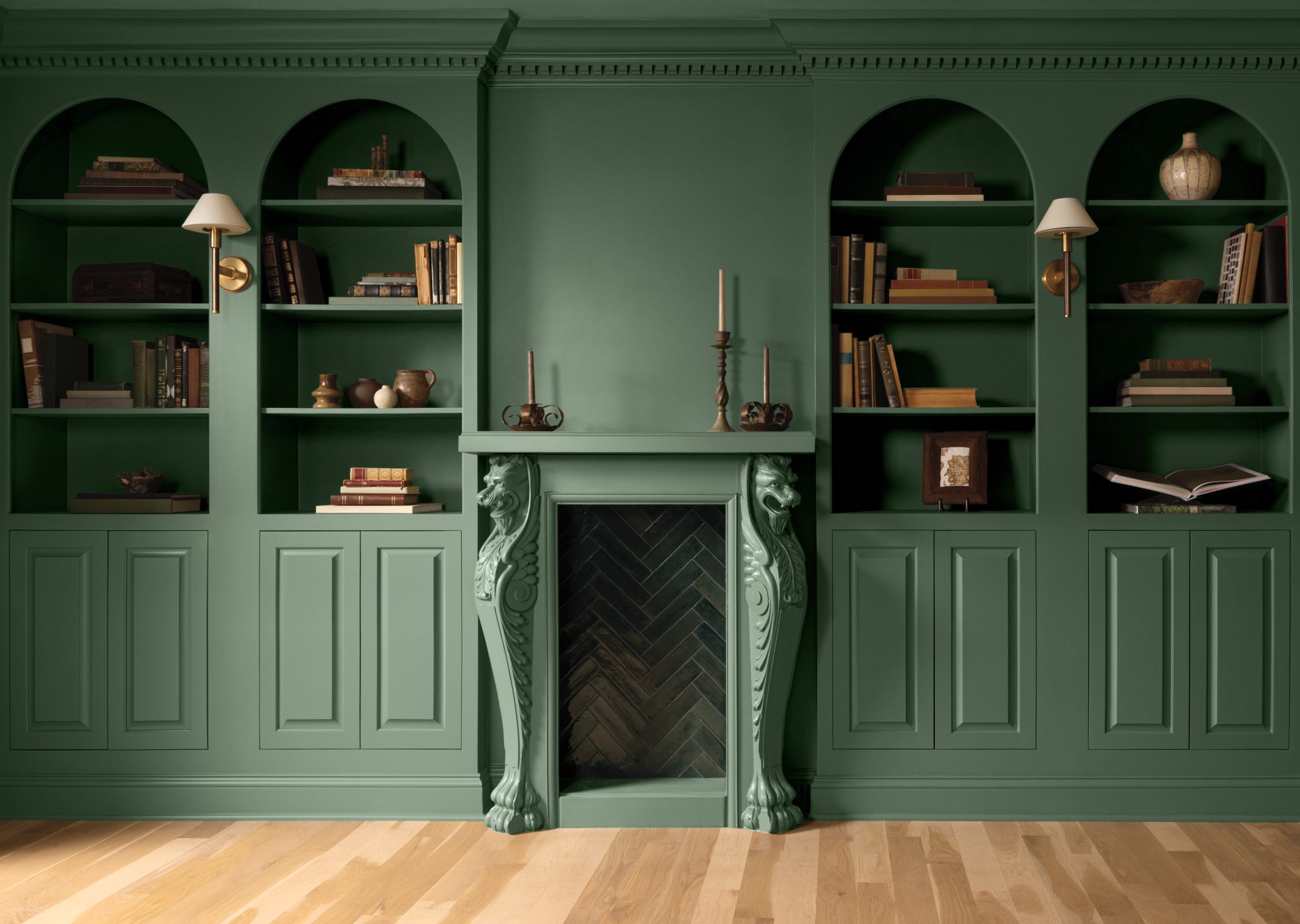
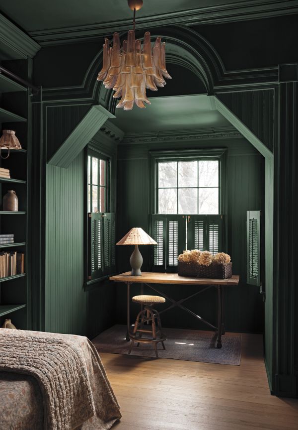
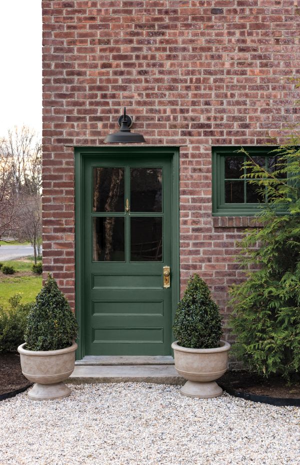
Webster Green HC-130 is remarkably versatile, making it well suited for a variety of applications throughout the home. Its depth and sophistication allow it to serve as a sophisticated accent, a distinguished choice for a living room or study, an expressive color for kitchen cabinetry, or a welcoming front door. Its balanced character enables it to move comfortably across traditional, contemporary and transitional interiors. Whether used as a focal point or applied more broadly, Webster Green brings richness, personality and a sense of composure to a space.
Many homeowners already have established furniture, artwork and accessories. How can they incorporate Webster Green into their existing décor without having to completely redesign a room?
One of Webster Green HC-130’s greatest strengths is its versatility. Its blend of blue, yellow and earthy undertones allows to pair beautifully with a wide range of colors, materials and design styles.
For homeowners looking to introduce the color, we always recommend starting with what already exists in the space. Use a Benjamin Moore color sample to evaluate the color alongside key furnishings, artwork and textiles, paying particular attention to the room’s largest pieces and focal points. Webster Green works especially well with natural materials, wood tones and warm neutrals, which help create a layered and inviting environment. For a more contemporary look, pairing it with an off-white – such as White Down OC-131 from the Color Trends 2027 palette – creates contrast and allows the richness of the green to take center stage.
For someone who loves Webster Green but is hesitant to commit to such a distinctive colour, what are some creative, approachable ways to introduce it into their home?
While Webster Green HC-130 is a confident hue to anchor an entire room, it is equally effective in smaller moments throughout the home. For exteriors, a Webster Green front door can instantly elevate curb appeal while creating a natural connection to the surrounding landscape. For the indoors, start small with built-in cabinetry or an accent wall. Small spaces such as powder rooms, mudrooms and entryways are also ideal places to experiment with richer colors that may feel too bold in larger rooms.
The beauty of Webster Green, and the Color Trends 2027 palette, is that these hues feel both expressive and enduring, bringing personality and character to a space without overwhelming it.